Mobile-First Link-in-Bio Design Principles
Nearly all bio-link traffic is mobile. The tap targets, contrast, and load-speed fundamentals that keep visitors from bouncing.
Almost everyone who opens your bio page is on a phone, holding it in one hand, half-distracted. If your page assumes a desktop with a mouse and a big screen, it quietly loses most of its visitors. Designing mobile-first here isn't a nice-to-have; it's the only context that matters.
This builds on the complete guide to link-in-bio for creators, and works hand in hand with getting your link order and hierarchy right.
Why mobile is the only context that matters here
Bio links live in social apps, and social apps live on phones. Nearly every tap on your page comes from a small screen over a mobile connection, often outdoors in bad light. Design for that reality first and the desktop version takes care of itself. Do it the other way around and the majority experience suffers.
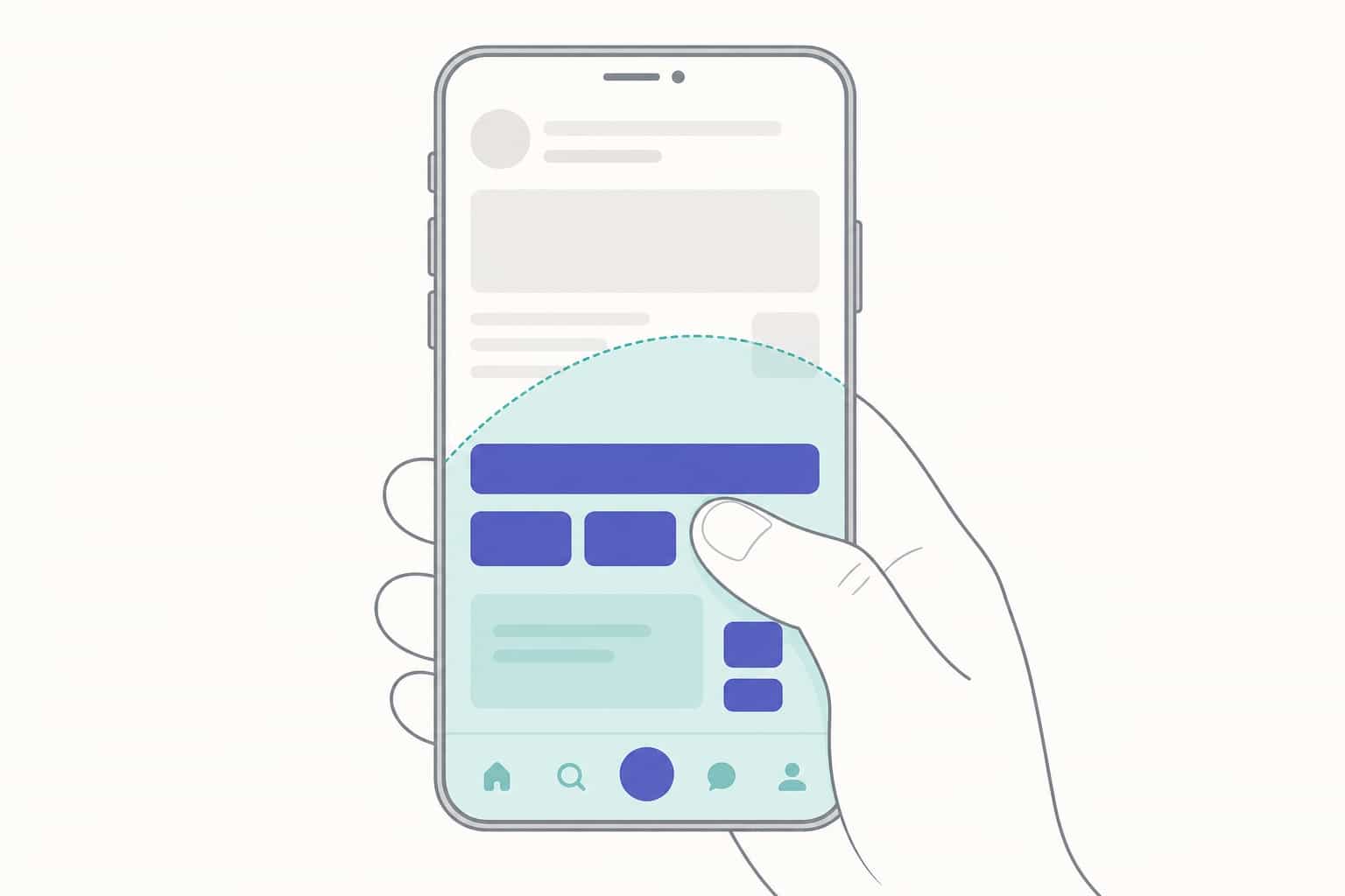
Preview your page the way your audience sees it: on a phone, not a roomy browser window.
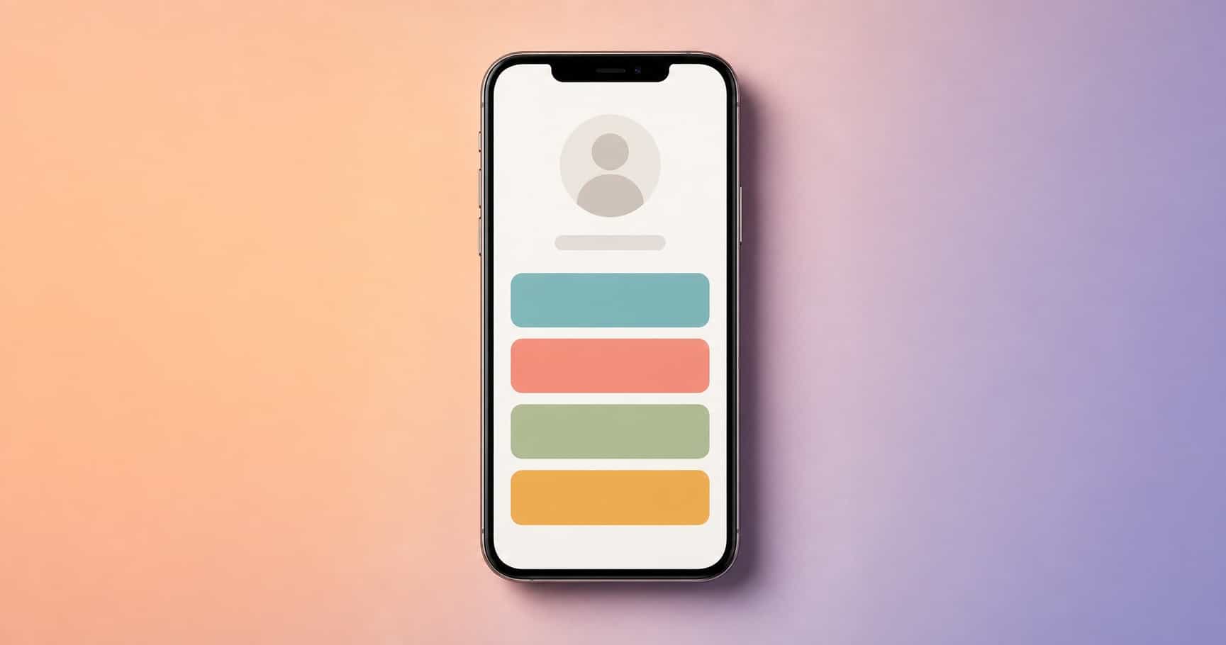
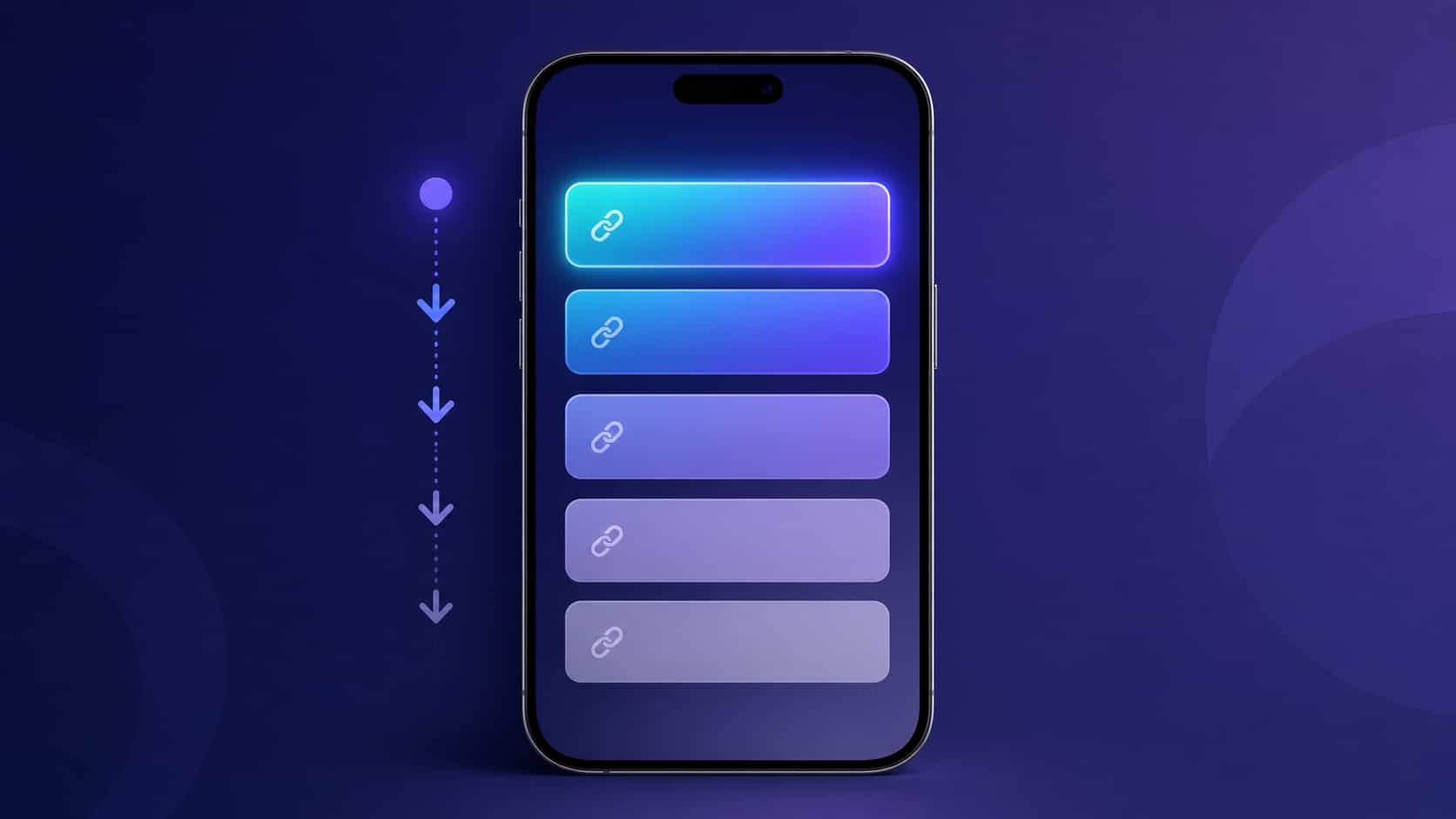
Tap targets and thumb zones
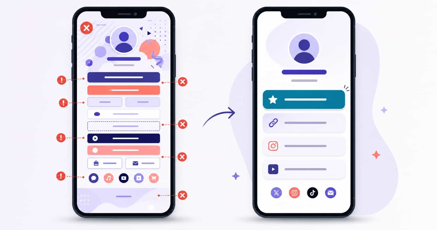
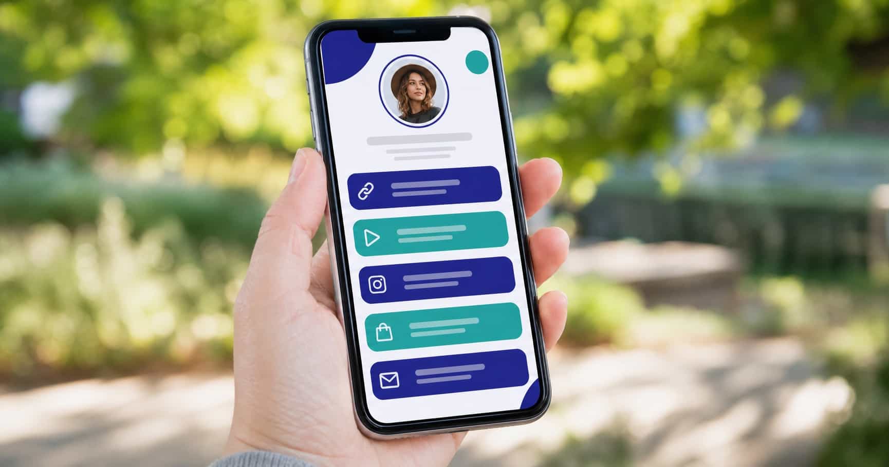
Fingers are not cursors. Buttons need to be big enough to hit confidently and spaced enough that the wrong one doesn't get tapped. Cramped links cause mis-taps, and a mis-tap is a visitor gone.
Keep your most important actions within easy thumb reach, toward the center and lower half of the screen where a thumb naturally rests.
Contrast and readability outdoors
A lot of scanning happens on the move, in sunlight, on a dimmed screen. Low-contrast text that looks elegant on your monitor can be invisible on a phone outside. Pair dark text with light backgrounds (or the reverse) and avoid thin, faint type.
If you can't read your own page at arm's length outdoors, neither can your audience. Your profile photo and avatar should hold up at small sizes for the same reason.
Load speed and lightweight media
Every extra second of load loses visitors before they ever see a link. Heavy background images and oversized media are the usual culprits. Keep media light and let the page appear fast.
Speed is a feature. A page that loads instantly feels trustworthy; one that hangs feels broken.
Avoiding layout shift
Nothing frustrates like tapping a button that jumps as the page finishes loading. Content that shifts under a thumb causes accidental taps and second-guessing. Reserve space for images so the layout stays put from the first paint.
A stable page feels solid. A jumpy one makes people hesitate, and hesitation costs taps.
Testing on real devices
A desktop preview lies. The only honest test is your page open on actual phones, ideally a few different ones, in the conditions your audience uses them. Tap every link, read every label, time the load.
Catching the small stuff here is what separates a page that converts from one that almost does. While you're at it, scan for the common link-in-bio mistakes that quietly cost clicks.
Frequently asked questions
What size should tappable buttons be?
Large enough to hit comfortably with a thumb, with clear spacing between them.
Does load speed really matter?
Yes; slow pages lose visitors before the first tap.
How do I test mobile design?
Open your profile on several real phones, not just a desktop preview.