Organizing Your Links: Priority, Order, and Visual Hierarchy
How ordering, grouping, and visual weight steer attention down your page toward one primary action.

You can have great links and a sharp description and still lose visitors, simply because the order is wrong. Attention on a bio page flows top to bottom and runs out fast. How you arrange, group, and weight your links decides what most people actually see before they leave.
This is a focused companion to the complete guide to link-in-bio for creators, and it pairs naturally with writing link labels that convert.
Attention flows top to bottom
Visitors read a bio page in seconds and rarely reach the bottom. Whatever sits in the first screen gets the vast majority of taps. So the question isn't "what links do I have?" It's "what does someone see before they stop looking?"
Treat the top of your page as prime space and everything lower as a steep drop-off. Position accordingly.

Pick one primary action
Before ordering anything, decide the single thing you most want a visitor to do right now. That primary action goes first, with nothing competing above it. Every page benefits from one clear lead instead of five equal options.
If you can't name your primary action, your visitors can't either, and a page with no clear lead spreads taps thin across everything.
Grouping related links
Once your primary action is set, group the rest into clean sections so the page reads in chunks instead of one long list. Music in one group, shop in another, social in a third. Grouping reduces the effort of scanning and helps people find the thing they came for.
A grouped page feels organized and intentional. A flat list of ten links feels like a chore.
Visual weight: size, color, icons
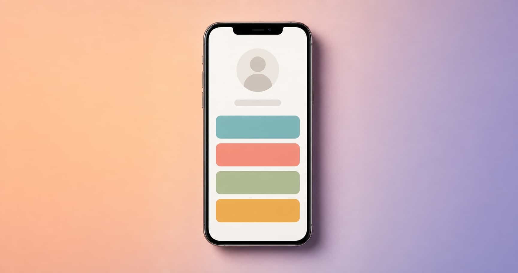
Order isn't the only lever. Size, color, and icons all signal importance. Your primary action can be visually heavier, a stronger color or a larger button, so it stands out even to someone skimming.
Use this sparingly. If everything is emphasized, nothing is. One clear focal point per screen is the goal.
Reordering for seasons and launches
Your priority isn't fixed. During a launch, the launch link belongs at the top, even if it lives lower the rest of the year. After a season passes, move it back down and restore your evergreen lead.
Make reordering a habit tied to what you're currently pushing. A page that reflects this week's priority always outperforms one frozen since setup.
When to hide or archive links
More links almost always means fewer taps on the ones that matter. Periodically cut links that no longer serve a current goal. If something hasn't earned a tap in months, archive it; you can always bring it back.
A lean page is not a limited page. It's a focused one, and focus is what converts. Check your creator analytics to see which links actually earn their spot, then order the page around the evidence rather than habit.
Get the order right and the same links suddenly perform better, because more people see the ones that count. Lead with one action, group the rest, weight what matters, and keep it current.
Frequently asked questions
How many links is too many?
When visitors scroll past your priority without acting. Lead with three to five and archive the rest.
Should my newest link go on top?
Only if it is your current primary action. Recency alone is not a reason for the top spot.
Can I group my links?
Yes. Grouping related links into clean sections reduces choice overload and helps people scan.