Link in Bio Examples: 12 Pages by Niche You Can Copy
12 link in bio examples by niche (musician, YouTuber, photographer, salon, shop, podcaster and more) with the exact link order, button titles, theme and why each one works.

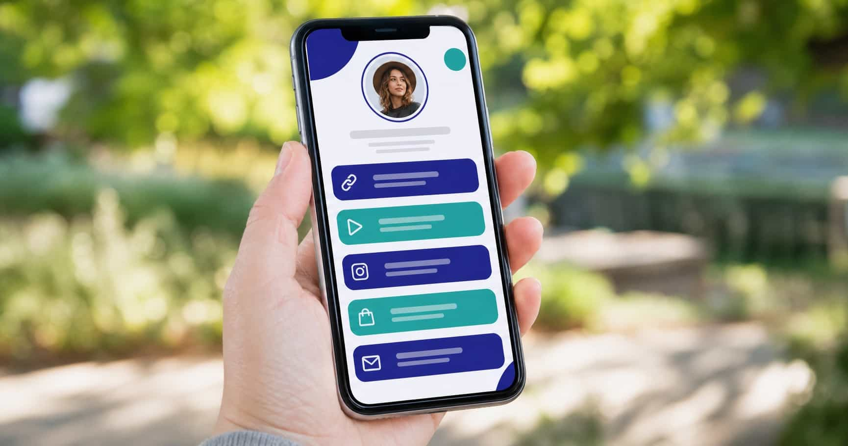
Looking at other people's pages is the fastest way to build your own. The problem with most link in bio examples online is that they show a pretty screenshot and stop there. You can see the colors, but not the decisions behind them: which link went first, how the buttons are named, what got moved to icons and what was left out.
Below are 12 link in bio examples by niche, written out so you can copy them: the exact link order, button titles that say what people get, the look that fits, and why each setup works. Whether you build on Linktree, VISU or another tool, the structure carries over. The looks use real themes from the VISU editor, so you can reproduce them in a few minutes.
What every good link in bio example has in common
Before the examples, the four patterns you will see in all of them:
- One main action at the top. Most visitors tap one of the first buttons and leave. The first link is whatever matters most this week.
- Titles that say what you get. "Listen to the new single", "Book a session", "Shop the spring collection". Never "Click here" or a bare URL.
- Socials as icons, not buttons. Instagram, TikTok and YouTube go in small icons below the bio, which leaves the big buttons for actions.
- Five links or fewer. Short pages look calmer and get clearer clicks. White space is part of the look.
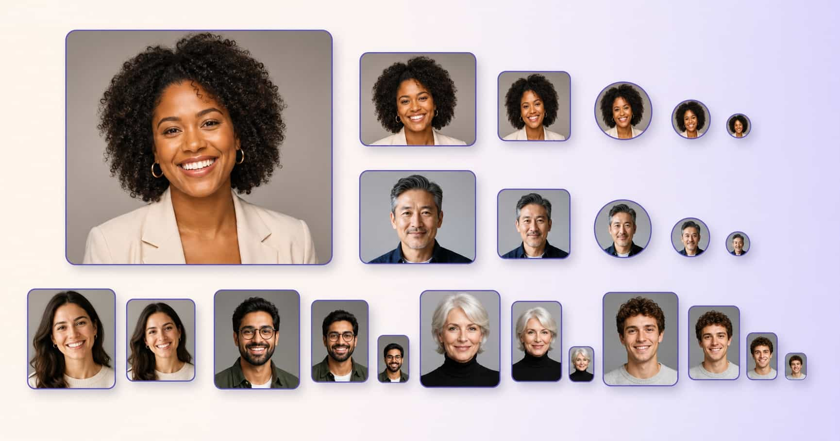
Your profile photo sits at the top of every example, so it matters too. Our guide to choosing the perfect profile photo covers framing that works at small sizes.
12 link in bio examples you can copy
1. Musician with a new single
- Listen to "Night Drive" (smart link to every streaming app)
- Watch the music video
- Tour dates and tickets
- Merch store
- Join the mailing list
Look: Graphite, a near-black background with outlined square buttons. Why it works: the release is first while it is new, and evergreen links sit below. When the next single drops, only the first button changes.
2. YouTuber
- Latest video: "I tried 30 days of..."
- Gear I use
- Business inquiries
- Join the Discord
Look: VISU Night, deep blue-black with a cyan accent. Why it works: it points people to the newest upload instead of the channel home, which is where they already came from.
3. Photographer
- Book a portrait session
- Portfolio: weddings
- Portfolio: portraits
- Prints shop
Look: Snow, white background and light grey pill buttons, so the photos in the portfolio do the talking. Why it works: splitting the portfolio by type lets a bride and a headshot client each find their page in one tap.
4. Fitness coach
- Free 7-day starter plan
- Apply for 1:1 coaching
- Client results
- Workout app
Look: Mint, a pale green background with teal pill buttons. Why it works: the free plan comes first for cold visitors, and the paid offer sits right under it for people who are ready.
5. Nail or hair salon
- Book an appointment
- Price list
- Chat on WhatsApp
- Find the salon (map)
Look: Lavender, a pale lilac background with deep indigo pill buttons. Why it works: it answers the three questions every DM asks: when, how much, where.
6. Small online shop
- Shop new arrivals
- Best sellers
- Shipping and returns
- Wholesale inquiries
Look: Sand, a soft beige background with white rounded buttons and a rust accent. Why it works: "new arrivals" changes every drop, while shipping info removes the doubt that stops a first order.
7. Podcaster
- Latest episode
- Listen on Spotify
- Listen on Apple Podcasts
- Be a guest
- Sponsor the show
Look: Wine, a deep burgundy background with a pink accent. Why it works: listeners pick their app in one tap, and the last two buttons quietly handle the business side.
8. Writer with a newsletter
- Subscribe to the newsletter
- Read the latest issue
- My book
- Speaking and workshops
Look: Paper, an off-white background with dark rounded buttons. Why it works: subscribe is first because it is the one link that keeps the relationship going after the visit.
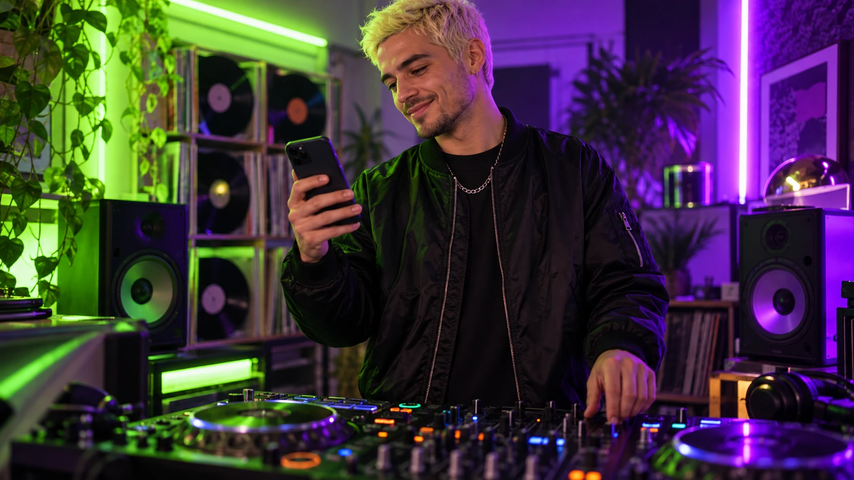
9. DJ
- Next show: Saturday
- Latest mix
- Booking inquiries
- Press kit
Look: Neon, black with lime square buttons and the cover banner on. Why it works: promoters and fans both land here, and each finds their button without scrolling.
10. Tattoo artist
- Request a session
- Available flash
- Healed work
- Aftercare
- Studio location
Look: Graphite or Forest, a dark green background with soft rounded buttons. Why it works: it follows the order of a real booking: request, browse, trust, after the session, how to get there.
11. Real estate agent
- Homes for sale this week
- What is my home worth?
- Book a call
- Client reviews
Look: Sky, a pale blue background with white rounded buttons and navy text. Why it works: buyers and sellers get separate buttons, and the call booking turns either into a lead.
12. Student or job seeker
- Resume (PDF)
- Portfolio
- Email me
Look: Bauhaus, a yellow background with black square buttons and a red accent, or Snow if your field is conservative. Why it works: a recruiter gets everything in four taps, and the page fits on one screen.
For more setups by industry, our use cases show how different niches organize their pages.
How to copy one of these examples on VISU
- Create your page and add the links from the example that fits you, in the same order.
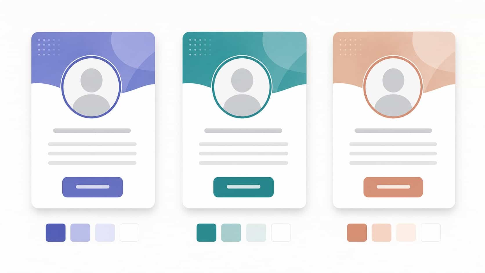
- In your VisuLink editor, open the Theme tab. Themes are grouped as Dark, Light and Bold (labels in the app may vary slightly). Tap the one named in the example and check the live preview in phone size.
- Open Customize to adjust Background, Accent, the button format (Pill, Rounded or Square, plus an Outlined option), button and text colors, and Show banner on top.
- Add Instagram, TikTok, YouTube and the rest as Social Icons below your bio, not as buttons. You can tint them to match the theme.
Once you change anything, the editor marks the theme as custom, based on the original, so you can always go back. The free plan includes 5 links and 5 social icons, which covers every example above. Paid plans raise the limit if you need more (10 on Starter, 20 on Pro, unlimited on Premium).
Button order rules that apply to any example
- Most important link first. Change it when your priority changes: a launch, a sale, a new video.
- Hide instead of delete. Seasonal links can be switched off with their on/off toggle and turned back on later.
- One link per goal. Two buttons that go to the same shop split attention for nothing.
- Test from the apps. Open your page from inside Instagram and TikTok, in daylight and at night, and tap every button.
For a deeper walkthrough, see our guide on mobile-first link in bio design, which also covers tap sizes and spacing.
Common mistakes when copying link in bio examples
- Copying the look, not the logic. A beautiful page with the wrong first link still loses clicks.
- Low contrast for the sake of mood. If you squint and can't read a button, neither can your visitors.
- Too many colors. Background, buttons, text and one accent is plenty.
- Links that never change. A "latest video" button pointing to last year's video tells people the page is abandoned.
- Different name and photo from your profile. Visitors should recognize you the moment the page opens. Our post on color, theme and visual identity covers keeping the look consistent across platforms.
Quick recap
- Pick the example closest to your niche and copy its order, not only its colors.
- One main action first, clear titles, socials in icons.
- Five links or fewer, with seasonal ones hidden instead of deleted.
- Check contrast and tap every button on a real phone.
The best link in bio example is the one that matches what you want people to do today. Create your free VISU page, copy one of these setups and make it yours in a few minutes.
Frequently asked questions
What should I put in my link in bio?
One main action first (your newest release, booking or shop), then three or four links people actually need, with titles that say what they get. Put your social profiles in icons below the bio instead of using buttons for them.
How many links should a link in bio page have?
Five or fewer works for most people. Short pages look calmer and get clearer clicks, and seasonal links can be switched off and back on instead of piling up.
What is a good link in bio example for a small business?
Book or shop first, then prices or best sellers, WhatsApp or contact, and location or shipping info. Those buttons answer the questions customers usually send by DM.
How do I make my link in bio look aesthetic?
Pick one background color and one accent that match your feed, choose a button shape that fits the mood, keep contrast readable and limit the page to a few links. Starting from a ready-made theme and adjusting it is the fastest way.
Can I copy a link in bio example for free?
Yes. On VISU the free plan includes 5 links and 5 social icons, which is enough to reproduce every example in this guide, including the theme and button style.