Color, Theme, and Visual Identity for Your Profile
Choosing a palette, applying it consistently, and keeping contrast readable — the visual identity that makes a profile unmistakably yours.

Color is the fastest thing a visitor processes, before a single word. A consistent palette and theme are what make a profile feel like yours instead of a default template. Get this right and people recognize you in a glance.
This pairs with building a memorable personal brand — color doing the visual half of the job your bio does in words.
Color as instant recognition
A signature color does quiet work: it ties your profile to your posts, your thumbnails, your merch. When the same hue shows up everywhere, people start associating it with you. That recognition compounds over time.
Pick a color you can commit to across everything, not just one that looks nice today.

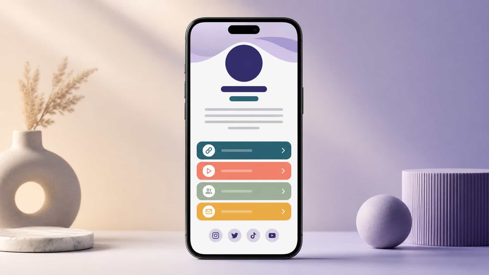
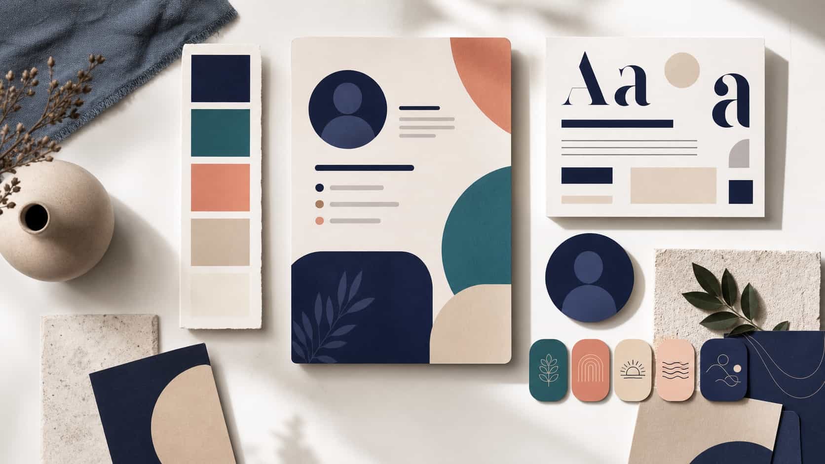
Building a simple palette
You don't need a designer's swatch book. Two or three colors plus neutrals is plenty: one main, one accent, and a background that lets them breathe. More than that and the page turns noisy.
Start from one color you love and build outward. Restraint reads as intentional; a rainbow reads as unfinished.
Applying a theme consistently
A palette only works if it's applied the same way every time. Use your accent for the things you want tapped, your neutral for everything else. Consistency is what turns a few colors into an identity.
Decide the rules once, then follow them. Predictable beats clever here.
Accessibility and contrast
Pretty doesn't matter if it can't be read. Pair dark text with light backgrounds or the reverse, and avoid faint, low-contrast combinations that vanish on a phone outdoors. The same mobile-first reality applies to color.
If you have to squint, so does everyone else. Test your worst-case screen.
Matching your theme to your other platforms
Your profile shouldn't look like a stranger next to your social accounts. Carry the same colors and feel across platforms so a visitor knows it's the same person. Your profile photo anchors this; let the palette extend it.
Consistency across surfaces is what makes you recognizable in a crowded feed.
Refreshing a theme without losing identity
Themes can evolve, but evolve slowly. Shift a shade, update an accent, but keep the core recognizable so loyal followers aren't disoriented. A total repaint resets the recognition you've built.
Change the paint, keep the bones. When color and bio align, your whole profile reads as one coherent brand.
Frequently asked questions
How many colors should a palette have?
Two or three, plus neutrals.
Does theme really affect engagement?
Yes; recognizable, readable profiles hold attention.
How do I keep contrast accessible?
Pair light text with dark backgrounds (or vice versa) and test readability.